Frodsham Better Lawns & Trees

Branding & Identity

Logos

The Frodsham Better Lawns & Trees logo is designed to be simple, recognizable, and versatile across print, digital, and field applications. The mark combines a bold wordmark with the hat icon to reflect the company’s long-standing, locally rooted identity and hands-on approach to lawn, tree, and pest care in Davis County.
Black and white Frodsham Better Lawns & Trees logo with cowboy hat icon, representing Davis County Utah lawn care, tree care, and pest control.

Black | #000000

Frodsham Better Lawns & Trees logo on dark background representing Davis County Utah lawn aeration and pest control services.

Green | #2C5234

Frodsham Better Lawns & Trees logo for Davis County Utah pest control and lawn aeration services for residential properties.

White | #FFFFFF

To maintain consistency and brand recognition, the logo should not be altered, recolored outside approved brand colors, stretched, or placed on backgrounds that reduce legibility. Adequate spacing should always be preserved around the logo so it remains clear and uncluttered in all applications.

Colors

The Frodsham Better Lawns & Trees color palette is intentionally grounded and restrained. The colors reflect the company’s focus on reliability, longevity, and working in real outdoor conditions rather than following visual trends. This palette supports clear communication across digital, print, and field applications while staying consistent with the brand’s long-standing presence in Davis County.

Black (#000000)

Primary foundation color used for logos, body text, and high-contrast applications. Ensures maximum legibility across print, digital, uniforms, vehicles, and field materials.

Green (#2C5234)

Primary brand accent representing lawn health and growth. Used for headings, buttons, highlights, and key brand elements. Should always feel grounded, not bright or decorative.

Dark Brown (#382E2C)

Supporting accent color that adds warmth and balance. Works well for secondary sections, dividers, and backgrounds that reference soil, trees, and natural materials.

Light Neutral (#F0EEE9)

Used for backgrounds and negative space to keep layouts clean and readable. Allows imagery, typography, and brand colors to stand out without visual clutter.

To maintain consistency and brand recognition, colors should not be substituted, altered, or expanded without approval. Avoid introducing additional accent colors that dilute the palette. All uses should prioritize readability, contrast, and real-world visibility across screens, print, and outdoor conditions.

Photography

Photography used by Frodsham Better Lawns & Trees should reflect real work, real conditions, and real results. Images must feel honest, grounded, and practical, not staged or overly polished. The goal is clarity and trust, not perfection.
Priority should always be given to original photography taken during actual service visits whenever possible. When stock photography is used, it must closely match Utah conditions, Davis County neighborhoods, and the types of lawns, trees, and pests we work with locally. Avoid imagery that looks generic, overly lush, or unrealistic for Northern Utah.
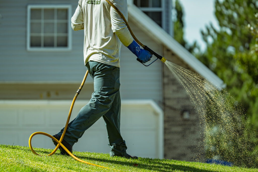
Technician applies fertilizer service and weed control with hose sprayer on residential lawn in Davis County Utah during spring growth.
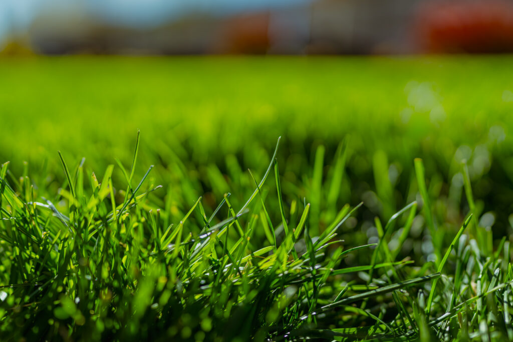
Close-up of healthy grass blades in Davis County Utah lawn care program, showing thick turf after weed control treatment.
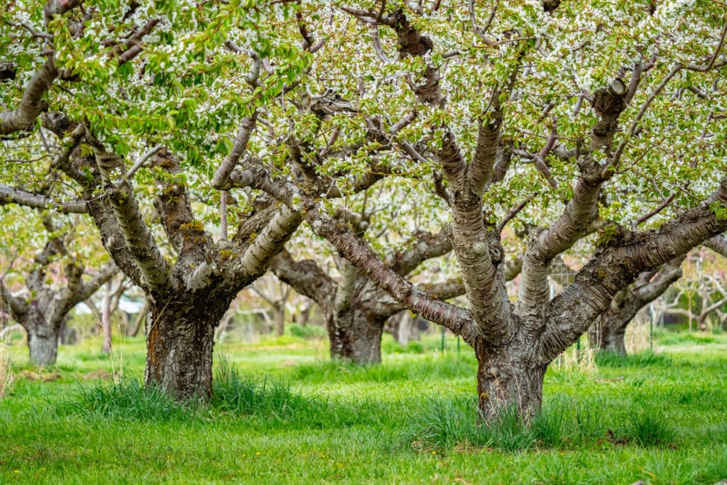
Orchard trees blooming above green grass in Davis County Utah, highlighting tree care and pest control planning. Image by Rex Jones https://rexjones.photo
Yellowjacket on green leaf, a reminder to schedule pest control near me for stings around Davis County Utah homes. Image by Robert Schwarz https://www.pexels.com/@robert-schwarz-1488822070
Composition should be simple and purposeful. Subjects should be clear and easy to understand at a glance, whether viewed on a phone, desktop, or printed material. Backgrounds should not distract from the subject or introduce visual clutter.
Photography should communicate professionalism, care, and competence. Every image should reinforce that Frodsham is experienced, local, and focused on doing the job right rather than putting on a show.

Writing

All written content for Frodsham Better Lawns & Trees should sound like it comes from an experienced local professional, not a marketing team. The voice should be calm, practical, and straightforward, reflecting decades of real work in Davis County rather than polished sales language.
Writing should be clear and easy to read. Sentences should stay short, direct, and focused. Paragraphs should cover one idea at a time and move cleanly without dramatic transitions, filler, or clever phrasing. If something sounds generic or overly smooth, it should be rewritten.
Local specificity matters. Content should reference Davis County and Utah lawn conditions when relevant, including soil types, weather patterns, watering restrictions, and seasonal timing. Avoid vague language like “your area” or broad claims that could apply anywhere.
The tone should remain factual and restrained. Avoid buzzwords, hype, emotional language, or exaggerated promises. The goal is to explain how services work and what homeowners can realistically expect, not to persuade or upsell.
Keywords should support clarity, not drive the writing. Only approved keywords should be used, and only when they fit naturally into the sentence. Readability and accuracy always take priority over optimization.
Across service pages, landing pages, and blog posts, the standard is simple: the content should feel honest, local, and useful. It should sound like advice from someone who has seen these problems many times and knows how to handle them properly.